Here’s Why Apple Gets Transit Maps
This is Millennium Station:

Millenium Station is one of the downtown hubs for the Metra system in Chicago. The line runs south of the city, under Millennium Park, and along the lake. My friends and I used to take the University Park line to get to school on the south side.
But Millennium Station is not the easiest station to find, navigate, or understand. To this day, a lot of my friends still haven’t tried riding it, let alone Chicago tourists. I can’t count the number of times I’ve helped baffled tourists outside the station. For this reason, it’s mostly a commuter line for the ones that have the transit system down to a science. And maybe that’s fine.
But what frustrates me is that maps are supposed to help everyone find their way. Especially those completely unfamiliar with the way the transit system works. And yet, so many transit maps just create more confusion.
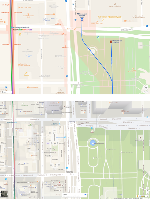
Part of the problem with current transit maps is the lack of entrance markings. The station itself (and the start of the line) is located directly underneath Millennium Park but the actual entrances are located about 5 minutes west and across the street. When these entrances aren’t marked on a map, new riders will wander the park, searching for a way to get down into the station. Until they give up, ask a local, and miss their train.
Even if you’ve managed to find way inside Millennium Station, it’s still difficult to get situated underground. Which way are you facing? Which way to the train? How do you get back outside? What’s above you? The other problem with current transit maps is the lack of mapping the station itself. After finding the entrance, riders need traverse the station to get on the appropriate train. An entire new maps exists underground. Signage helps of course, but so can a map with markings that show the boundaries of the station and exactly where the train lines run.
The hardest part of designing a map is choosing what details to show and what to hide. This becomes especially important in digital maps that can have various modes and change based on context.
I think Apple (above, Google below) has done a particularly good job designing their new transit maps. It’s a beautiful example of a map that shows exactly what matters for the current context. In this case, station entrances, boundaries, and train lines overlaid on a simple two-tone street map. The placement of these elements, I’ll note, is also extremely accurate.