Firewatch is a Beautiful Game
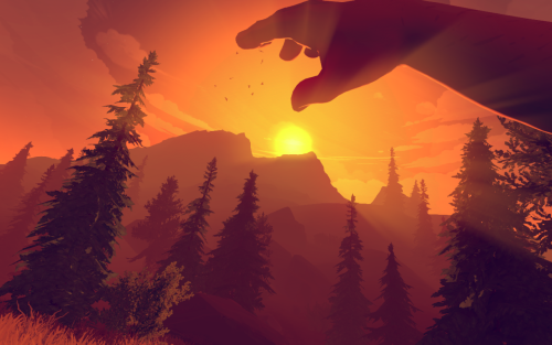
Five minutes into playing the new game Firewatch and chances are you’ll be in tears. If not because of the heartwrenching storyline and sparse piano chords, then because of the distinct, beautiful, graphic style.
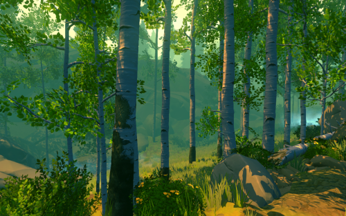
Firewatch is set in a world of warm and cool tones, muted colors, and hazy, chalky landscapes. Fuzzy rays of light seep through the sharp, simplified geometry of every pine tree, mountain range, and flying hawk. Camera movements are rendered with a dazzling motion blur, transforming scenes briefly into a series of abstract brushstrokes.
If it sounds like I’m analyzing a painting, it’s because I’m currently sitting in my art history lecture, but also, it’s because this game is a work of art, with a truly artistic style.
This got me thinking. Style is one of the most important aspects of causal games today. We see it in hits such as Monument Valley, Crossy Road, and Lumio City. Each of these carry their own style. For some it’s extreme minimalism. For some it’s “low-poly” geometries. For some it’s graphics completely rendered out of handmade and photographed paper sets (Lumio City).
Style is as important in games as it is in painting. It communicates something on its own terms. It identifies a game. I hope designers will continue to reference beautiful games, like Firewatch, to develop distinct styles of their own.
Good job Campo Santo, Panic, and team.