Snapchat Does It Different
Video calling. You thought you understood how it worked. It’s Skype. It’s FaceTime. It’s your friend requesting to see you in real time. (Probably when you don’t want them to.) You thought you understood how it looked too. Your friend’s face, fullscreen, front and center. Your face, smaller, off in the corner. (You look over there when you want to adjust your hair.) That’s video calling. Right?
Wrong. Just when you thought you had it all figured out—just when you got comfortable with video calling—it’s changing. That’s right. That FaceTime thing? Old news.
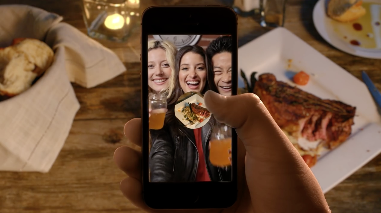
Snapchat has an update. Anotha one. This one transforms the chat feature from a nice-to-have into something much more substantive and familiar. It’s got video calling. It’s got audio calling too. It even has stickers. But let me be clear, this update does not make Snapchat just another messaging app. It is still, very much so, uniquely Snapchat. Allow me to explain.
 FaceTime or Snapchat? We’ll never know.
Uniquely Familiar
You see, there are lots of messaging apps out there. So many that it’s almost like there’s a template now for these sort of things. Because popular messaging apps all implement the same features: texting, video calling, stickers. But Snapchat continues to impress me in the ways it adds small, entertaining, irregularities to conventional communication methods. Snapchat’s implementation of these template features go beyond expectation. They are seemingly familiar but undoubtedly unique.
Take the implementation of video calling. It caught most users off guard when it was announced inside Snapchat in 2014. Because it was different. Video calling was only enabled when two friends were present in a text chat at the same time. And it only lasted as long as you pressed your finger on the screen. And your face was framed inside a small circle that followed your finger as it moved. It was different, but it wasn’t unintuitive. After using it once I found it quite natural. It was video calling the Snapchat way.
 Cheers.
Yesterday’s update added new features and built upon this approach. The update introduced stickers, but send multiple and they appear side by side, like words in a sentence. The stickers are even designed to build on each other. Send “up all night” followed by “dreaming of you” to really send the message. The update also introduced audio calling, but hold the call button to leave a short audio note. Multiple also appear side by side. Do the same with video. It’s just fun.
Keeping Things Interesting
Snapchat is always introducing more features like these. As soon as the service starts to get old, something new is introduced. In 2013 the introduction of the My Story feature kept things interesting. It added complexity just when users were starting to get bored. And if you haven’t heard, we millennials get bored. Hell, we don’t even follow the news unless it’s brought to us on Facebook as a 2-minute video.
The My Story feature quickly became an essential part of Snapchat. And as soon as stories started to feel normal, Snapchat was updated. Again. This time with a chat feature. And then we got Snapcash and then Geofilters and then Lenses. Yesterday we got yet another update. You get the idea.
It’s just fun, OK?
Snapchat has come a long way. When it first launched (and designers were too busy calling it ugly to realize its potential) the app was did one thing: sent photos that expired. This one feature was simple and fun to use. It was entertaining. I remember eating lunch at Square in 2013, the 16-year-old-me snapchatting back and forth with the other interns. “Hey Jack, what if Square partnered with this app to send money?” I said. Just kidding. I never said that.
The original Snapchat was just fun. And it was easy. You didn’t really need a reason for sending a Snap. Snapchatting stupid photos of myself was harmless. They would just disappear. I think of it like this: if calling someone was equivalent to ordering an entree, and texting someone was like ordering an appetizer, snapchatting was like having a snack. And you’re lying if you say you don’t snack.
 Snapchat is a lot like these Doritos.
Snapchat was a refreshing departure from other apps and services that took messaging so seriously. And that still holds true today. In fact, that’s sort of Snapchat’s thing.
So bring on the next feature. I don’t care if its a new way to send GIFs or new way to call Ubers. As long as it’s a little different and a blast to use, they’re doing something right.
Now back to helping my grandma set up FaceTime.
Behind Square's Elegant New Reader
Square is keeping on-pace with the evolving payments space. You’d never think they could outdo the sheer simplicity of the original reader—one that snapped in the headphone jack of your iPhone—but they have. The new NFC reader has the same elegance the original reader, perhaps even more.
Elegance isn’t easy to define. It’s much easier to see and experience. And to achieve elegance is a challenge. It takes time and finesse. But Square continues to do it. Because they care.
They care enough to build their reader from scratch. To engineer their own hardware. To engineer their own software too. They do it all and they do it really well. And in the end, it’s elegant. Sometimes their approach reminds me of another company.
“There are dozens of places where you can buy EMV software stacks, but we don’t want to do any of that, because we wanted to have end-to-end control of the system,” Dorogusker says.
In the article Jesse Dorogusker, Square’s hardware lead, also addresses the merchant-customer experience of NFC.
The NFC interaction is more about, you control your phone and watch. You’re not going to hand your phone to me. There has to be a way for my space and your space to be mediated.
Social norms are at the center of monetary transactions. People have a close, complex relationship with their money. This was something I couldn’t ignore during my internship at Square. Payment startups must consider social norms during their design process. Square is clearly doing this.
Oh, and as for that icon, that’s the unfortunate standard.
Firewatch is a Beautiful Game
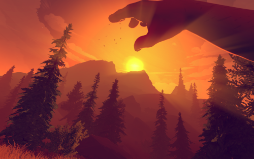
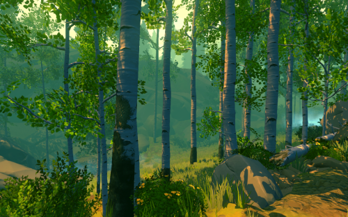
Five minutes into playing the new game Firewatch and chances are you’ll be in tears. If not because of the heartwrenching storyline and sparse piano chords, then because of the distinct, beautiful, graphic style.
Firewatch is set in a world of warm and cool tones, muted colors, and hazy, chalky landscapes. Fuzzy rays of light seep through the sharp, simplified geometry of every pine tree, mountain range, and flying hawk. Camera movements are rendered with a dazzling motion blur, transforming scenes briefly into a series of abstract brushstrokes.
If it sounds like I’m analyzing a painting, it’s because I’m currently sitting in my art history lecture, but also, it’s because this game is a work of art, with a truly artistic style.
This got me thinking. Style is one of the most important aspects of causal games today. We see it in hits such as Monument Valley, Crossy Road, and Lumio City. Each of these carry their own style. For some it’s extreme minimalism. For some it’s “low-poly” geometries. For some it’s graphics completely rendered out of handmade and photographed paper sets (Lumio City).
Style is as important in games as it is in painting. It communicates something on its own terms. It identifies a game. I hope designers will continue to reference beautiful games, like Firewatch, to develop distinct styles of their own.
Good job Campo Santo, Panic, and team.
UI Study of Mapping on iOS: Google vs. Apple
This is a fascinating breakdown of Google and Apple’s design conventions and a wonderful analysis of why certain decisions were made in the respective design teams. (Kind of old article, I know, but I only just read it today).
It’s worth reading the entire thing but I found the bit on designing first party apps particularly intersting. Mostly because I’ve never experineced it myself (and I look to first parties constantly for UI design guidance).
When you’re a first party app developer, there’s no saying “do as I say, not as I do”. If you create some crazy interaction for an app, it will be seen as Officially Sanctioned By Your Company Forever And Ever Amen. Other people will imitate anything you do. So you have to be extremely careful about the example you’re setting. And trust me, this makes your designs a lot more boring than when you’re in a small 3rd party startup.
What I love about this particular series of breakdowns is that they truly lack judgement. There’s no winner. There’s no competition. It’s all about learning. And I learned a lot. More of this!
This is not a contest, it’s a detailed design lesson.
Bret Victor Addresses Climate Change
Bret Victor, trained electrical engineer, ex-Apple designer, and king of dynamic interface design, recently published an article on how technologists (and designers, I may add) can make a impact on climate change.
Perhaps the biggest takeaway from his article is that there are thousands of ways, many of which are rarely discussed, that technologists can fight climate change. As Bret puts it, “Look at the stuff around the things.”
My point here is that there are many ways of contributing toward innovation in the production of clean energy without going off and building a fusion reactor. Look at the stuff around the things.
He provides loads of examples of this “stuff.” Little things—not fusion reactors. The algorithm used to determine where windmills should go, for example. Or the sensors put on dumpsters to provide trash collectors with optimal, efficient collection routes. Or even the tools/software required to develop and evaluate this stuff. A large part of his focus in the article is on developing these sorts of new tools. (FYI that’s sorta Bret’s thing).
I feel that technical tools are of overwhelming importance, and completely under the radar of most people working to address climate change.
It’s inspiring to think that with enough tiny, crazy ideas and breakthroughs to this “stuff” we could actually solve climate change. Hell, the tiny stuff isn’t even that tiny:
Protocols for moving data around were the big thing for a few decades. Then it was moving money around. The next big thing will be moving energy around.
The article also focuses a great deal on the need for new kinds of media to explain and understand the current climate situation. What does that mean? The article is full of bits and pieces of interactivity—sliders, graphs, etc. and it’s these sorts of features that more need to replicate. This way, readers can examine and critique the models, rather than just read them. (Again, sorta Bret’s thing).
Modeling leads naturally from the particular to the general. Instead of seeing an individual proposal as “right or wrong”, “bad or good”, people can see it as one point in a large space of possibilities. By exploring the model, they come to understand the landscape of that space, and are in a position to invent better ideas for all the proposals to come. Model-driven material can serve as a kind of enhanced imagination.
A lot of people tend to ignore the effects of climate change, or at least, assume they can’t do anything to help. I think this article will sway a lot of technologists and designers not to think that way. Because, well, it swayed me.
There are opportunities everywhere. Let’s get to work.
Pixar co-founder Ed Catmull on VR
I know several people working on VR projects right now, but I have yet to be impressed by what I’ve seen. Especially when it comes to VR movie experiences. There’s something about trying to tell a story in VR that doesn’t quite work, at least with the current hardware. I think Catmull hits the nail on the head when it comes to this. He says:
We have a whole industry which is gigantic: games. Games is very successful. It’s its own art form though, and it’s not the same as a linear narrative. Linear narrative is an artfully-directed telling of a story, where the lighting and the sound is all for a very clear purpose. You’re not just wandering around in the world.
When you give the viewer the freedom to wander in a virtual environment, it’s difficult to tell a linear story. This makes a lot of sense. There’s a reason a director hires a cinematographer. He or she knows how to line up the shot in just the right way to tell the story. But how do you “line up the shot” and guide the viewer in a VR movie experience? Maybe you don’t. Maybe that’s just not what VR is designed for. And maybe that’s fine.
The fact that you’ve changed the technology, and people are excited about it, doesn’t change the underlying difficulty of the compelling narrative story. Just like books aren’t the same things as movies. They don’t have to be.
Here’s Why Apple Gets Transit Maps
This is Millennium Station:
![]()
Millenium Station is one of the downtown hubs for the Metra system in Chicago. The line runs south of the city, under Millennium Park, and along the lake. My friends and I used to take the University Park line to get to school on the south side.
But Millennium Station is not the easiest station to find, navigate, or understand. To this day, a lot of my friends still haven’t tried riding it, let alone Chicago tourists. I can’t count the number of times I’ve helped baffled tourists outside the station. For this reason, it’s mostly a commuter line for the ones that have the transit system down to a science. And maybe that’s fine.
But what frustrates me is that maps are supposed to help everyone find their way. Especially those completely unfamiliar with the way the transit system works. And yet, so many transit maps just create more confusion.
Part of the problem with current transit maps is the lack of entrance markings. The station itself (and the start of the line) is located directly underneath Millennium Park but the actual entrances are located about 5 minutes west and across the street. When these entrances aren’t marked on a map, new riders will wander the park, searching for a way to get down into the station. Until they give up, ask a local, and miss their train.
Even if you’ve managed to find way inside Millennium Station, it’s still difficult to get situated underground. Which way are you facing? Which way to the train? How do you get back outside? What’s above you? The other problem with current transit maps is the lack of mapping the station itself. After finding the entrance, riders need traverse the station to get on the appropriate train. An entire new maps exists underground. Signage helps of course, but so can a map with markings that show the boundaries of the station and exactly where the train lines run.
The hardest part of designing a map is choosing what details to show and what to hide. This becomes especially important in digital maps that can have various modes and change based on context.
I think Apple (above, Google below) has done a particularly good job designing their new transit maps. It’s a beautiful example of a map that shows exactly what matters for the current context. In this case, station entrances, boundaries, and train lines overlaid on a simple two-tone street map. The placement of these elements, I’ll note, is also extremely accurate.